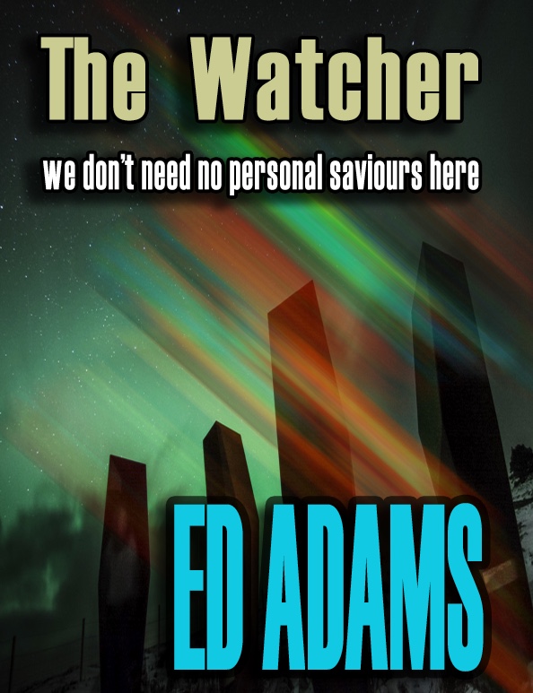
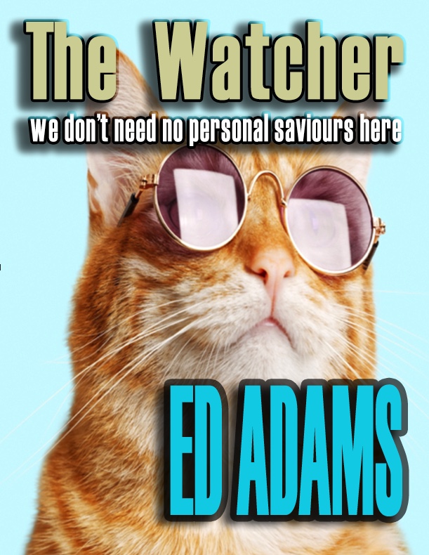
I've been getting opinions about cover designs recently, and apart from a particularly off-beat one from my family - not grammatically correct - needs to be more cheerful - how about adding a kitten?
- the rest of the variations are largely in a similar line.
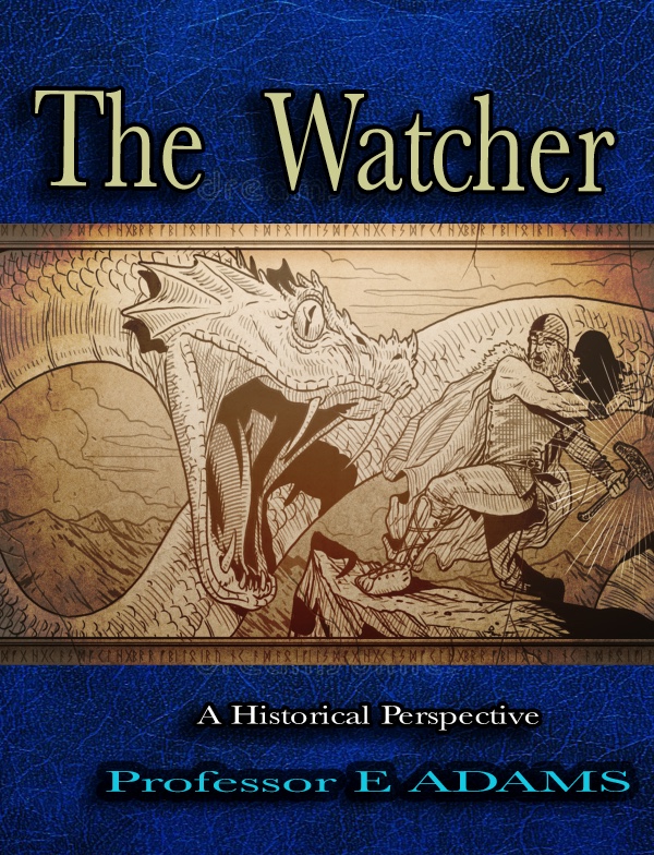
There was the dragon/serpent, which almost didn't finally make it to the cover art at all:
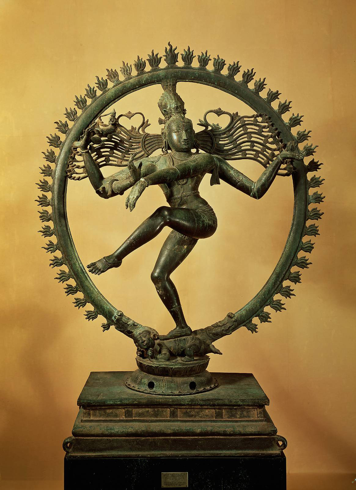
This would have worked if I'd wanted a school text book design, I think, but I had a similar problem with my first cover for The Triangle, which did look a little too much like a math textbook. Curiuously enough, I was at a party the other day and someone I didn't know very well introduced me as an author (ho ho). Then the other person to whom I was being introduced replied, 'Oh and what is your subject?' (Gulp). But back to cover designs. We had some ideas about Kali. Including the famous statue at CERN. A good idea, but only fleetingly relevant. I suppose the dragon made it to the first prototype: But it wouldn't get much further. I wanted to add some knowledge shards falling and a bit of earth in plight. However, the graphic of the Watcher gets lost at small size in this colourway, so time to experiment. But before that, I was asked to try a different theme:. But we were already along the right lines, so the next one cama along as: And so for a back cover. Now we need to get it published.


No comments:
Post a Comment