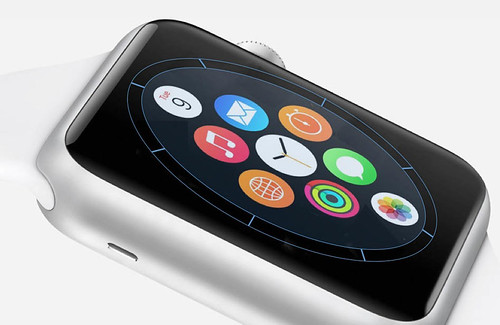
I've invented some Apps for the new Watch.
The first is called iSpacer. It's a black circle that doesn't do anything. It requires multiple installations around the edge of the visible Appspace on the fascia of the watch. It's only purpose is to take control of the space immediately around the main six/eight Apps that surround the watch App. It's there to declutter the face of the watch.
The next one is called iFolder. It's another circle, that this time lets you dig deep. Basically a folder selector so that instead of everything being on a flat watchworld, it's possible to drop down a level into a folder containing a related class of Apps.
iSpacer and iFolder can also be combined to create iWorld which provides the de-clutter circle, but this time with clickable drop down folders on each of the segments- it all works from the crown, or from the clickable front surface of the watch. Think planar.

By the time the slimline Watch Air appears (thinner, better battery life, extra bright screen for outdoor viewing, front facing camera, health functions that can run for extended periods without access to iPhone), everyone will be using iSpacer, iFolder and iWorld.
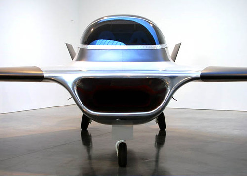
Maybe I'll put the revenue generated towards another kind of planar. One of those biomorphic Marc Newson iJets.

No comments:
Post a Comment