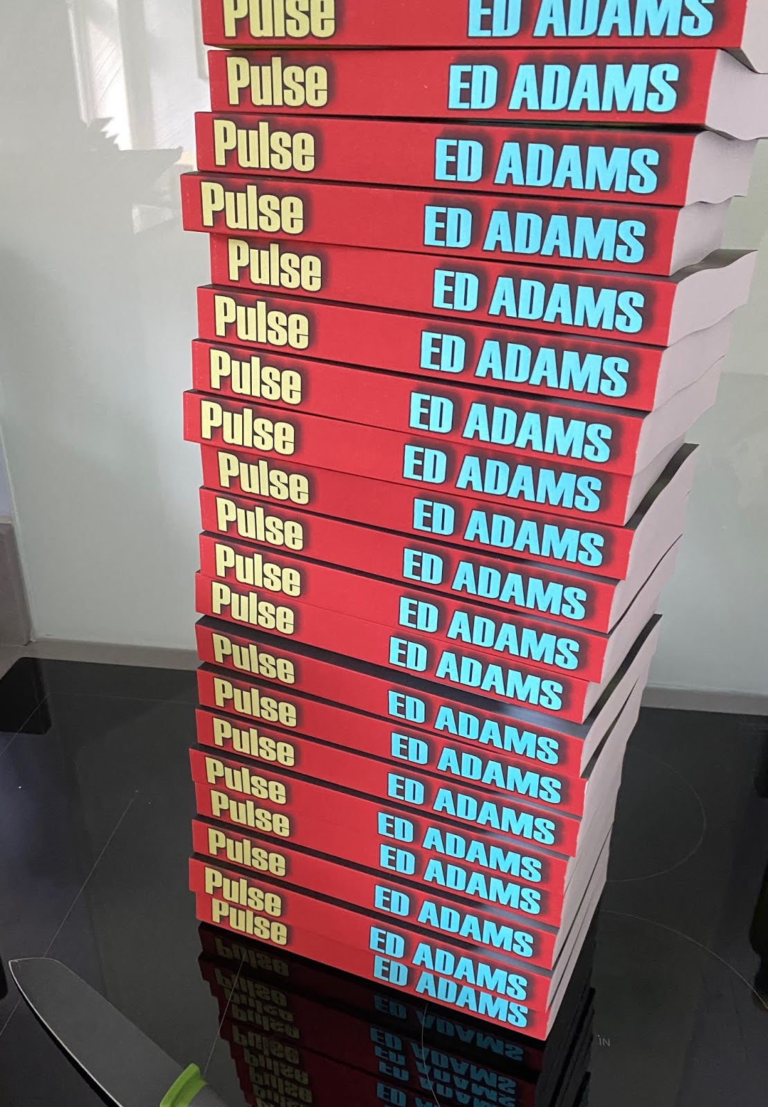
Thursday, 27 February 2020
just when you thought it was safe to go back in the library
After seeing this author's post about authoring a novel, it encouraged me to write my version.
There are several stages to getting the book to a publishable state, even before thinking about marketing and so-on. That can be for another day.
First of all, I should have an idea for the story. I tend to follow the three-act structure, with setup, challenges and resolution, but I use the 4 box storyboard, where, as each box boundary is crossed, another stake-raising event occurs.
There's another idea for a separate blog post.
Scrivener
I use Scrivener to write the story. It runs fine on the Mac and allows me to start with a template pre-configured with a story skeleton, plus binders to drop the characters and some research into.
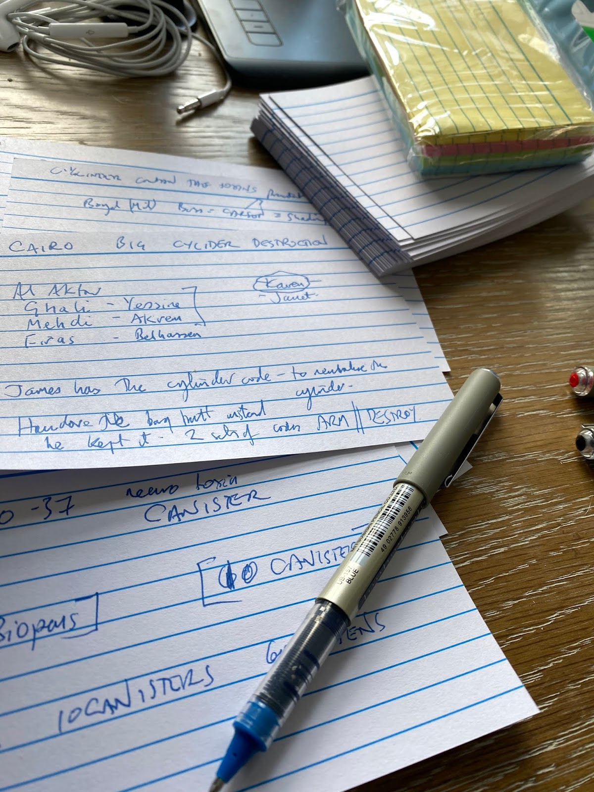
It uses a cards on corkboard metaphor, which helps with the sequencing and resequencing of the various scenes. That's not to say I won't go analogue for the first part, using those index cards available in Tescos, although I find I'm increasingly digital nowadays - thinking of how much time it will take to re-transcribe the relevant information.
Scrivener uses an outliner structure, mixed with the card scenes, and should be good for re-sequencing parts of the narrative. I do find that the drag and drop associated with the outliner is a little clunky and occasionally the scenes wind up in the wrong places unless I'm being particularly vigilant.
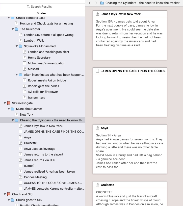
A versatility of Scrivener is that it can tip out many formats from the assembled text. Occasionally compiling the work is easy and can generate anything from double spaced courier A4 to a finalised paperback format, which is useful when reviewing.
Dragon Dictate and Mac voice recognition
Then it is all down to the writing, with as much of the screen as possible used for the typing and all the distractions switched off. Sometimes I have tried dictation, both to Dragon and using the native facilities of the Mac. Mac's facilities are not as good as Dragon's, but sadly Nuance discontinued the Dragon Dictate for Mac a couple of years ago. I could run it on Windows, under parallels, but it would need another licence which is inexplicably expensive, so I've abandoned it.
I've also found that dictation software was quite good at getting down an idea, but it would often stumble on words such as character names and create almost as much re-typing as if I simply typed it in the first place. A character called Bigsy, for example, became BC; Bigsby, VC, big sea and so-on.
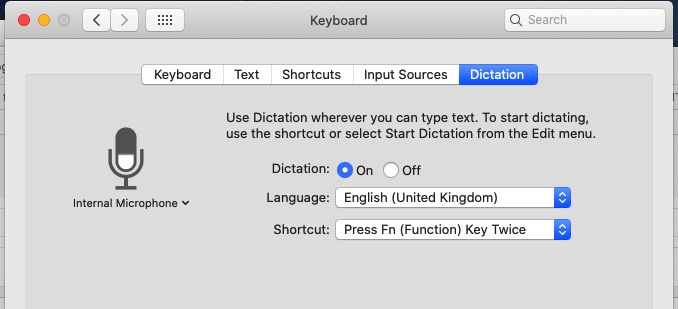
Additionally, the Mac dictation software will jump out of dictation mode unexpectedly and consequently leave large chunks untranscribed. Thre's a screenshot of how to fire up dictation mode, which is buried in the keyboard options of control panel on a Mac.
Review options. Microsoft Word
So far I haven't mentioned Microsoft Word. That's what I provide to reviewers of the document. Scrivener can output it and most people can use it, whether on a PC or a Mac. For reviewing the text, its a reasonable option.
Grammarly
I use two other tools, which also helps prevent me from going crazy when I need to review the finished (or interim) products. The first, inexpensive, option is Grammarly. On a Mac, until recently, it required the individual section to be pasted into a separate workspace. It does a pretty good job of tracking grammar and punctuation and will make a few suggestions for sentence re-work too. More recently, there's a Word option also available on Mac, where a Mac Word document can be reviewed directly. The checking is as thorough, but the user interface doesn't seem to highlight the passage being reviewed as clearly as the separate Mac App. I have mainly abandoned this form for longer reviews now.
ProwritingAid
My second review tool is ProwritingAid, which covers what Grammarly can do, but additionally has several other parses of the text and will provide a mind-blowingly good report of the writing quality. It includes vocabulary, unique words, word families, most used words, the dynamism of vocabulary, reading ease, readability by paragraph, sentence variety, passivity index, hidden verbs, adverbs, repeated sentence starts, style suggestions, grammar issues, sticky sentences, dialogue %, dialogue tags, pacing, use of transitions, cliches, redundancies, inconsistencies, vague, abstract and corporate words. Phew.
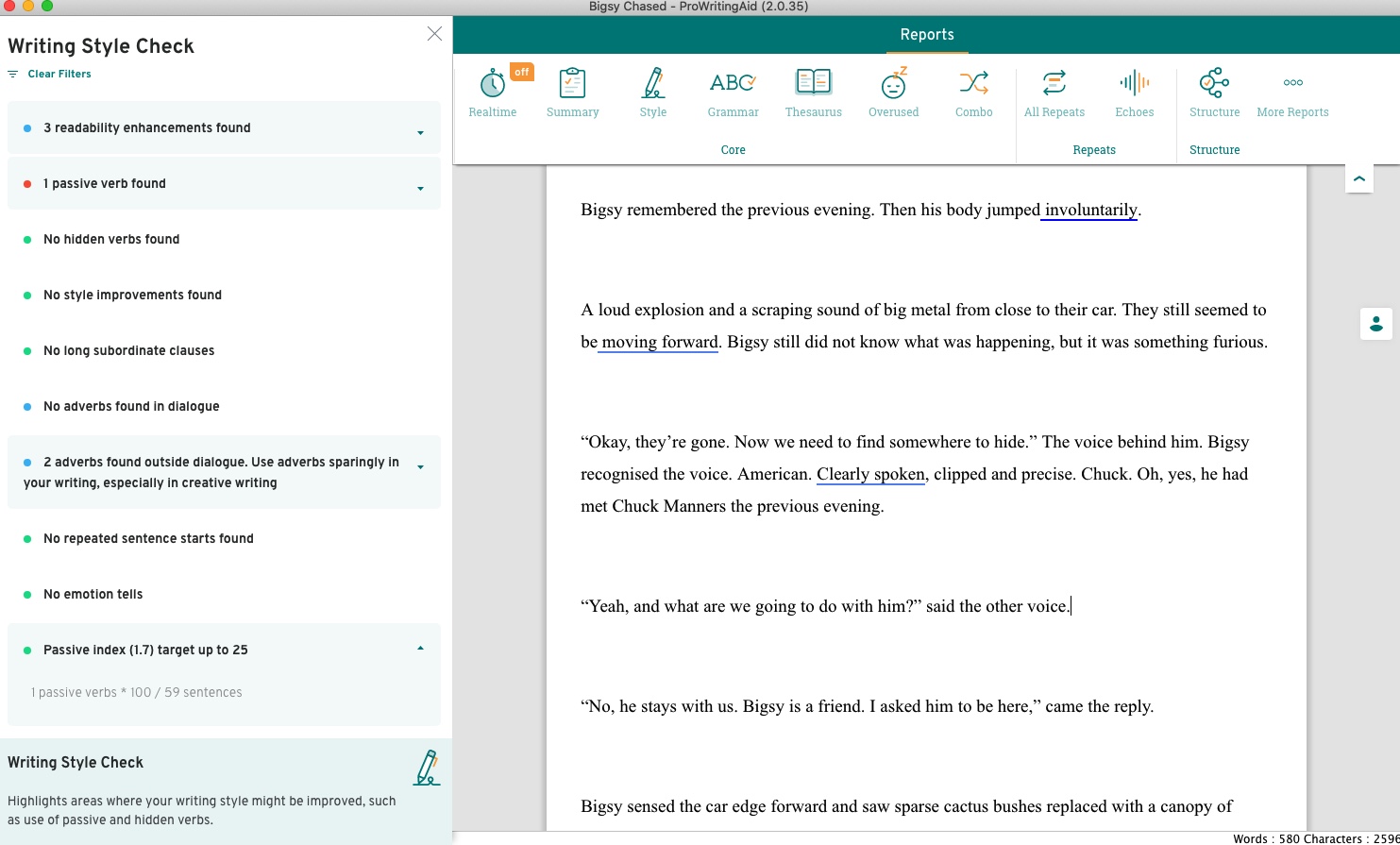
It also knows about and follows the structure of Scrivener, which is particularly useful when reviewing individual pages/chunks of a document. I like it because it provides a different perspective to look at the document also, which is useful after several run-throughs and the inevitable word-blindness which occurs.
Never Enough
I can safely say that in my case, with reviewers plus me, plus automated tools looking through the work, it is still not enough. It's amazing to me, but there's still commas, quote marks, and other mishaps that get through to the finalised product. I'm re-assured though, that even the big authors have this problem, and I see that several of my Kindle downloads of well-known novels by others are on multiple revisions as different bugs get swept away.
Cover design
There has to be a post about this too. Suffice to say, the cover is supposed to be genre-specific and use vanishing lines which lead the prospect 'into' the book. I use Photoshop for this part of the process and set the front cover dimensions to 2000 pixels at 300 dpi, which should generally be enough.
Blurb
Not forgetting the tag-line under the title and some back cover matter which describes the book.
Cover template
This needs to match the number of pages in the book, and I use the IngramSpark template generator to define this. In my case I want the template to be in Adobe InDesign format, and then it is a case of dragging the three elements to the template (Front Cover, Back Cover and Spine). It is important to have them each set to 300 dpi for this part of the process. I also save the document as a PDF with the pdf/x format, which is what the printers need.
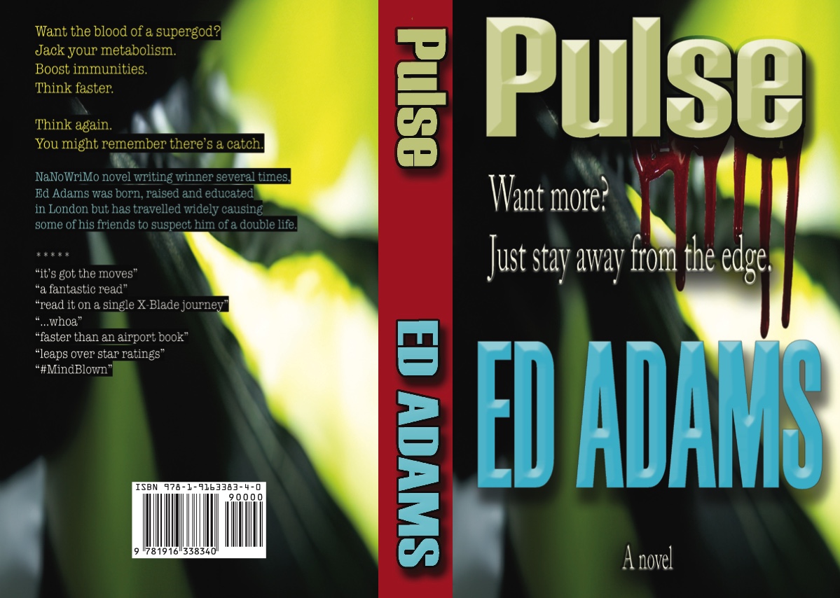
Book text
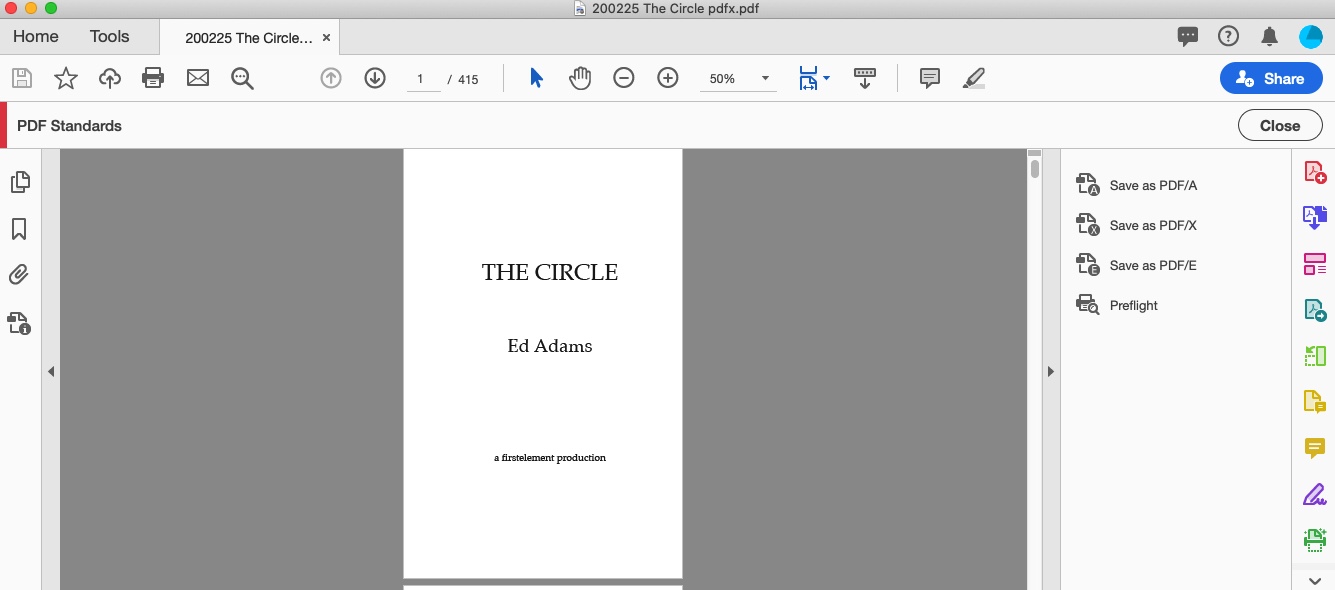
I suppose this depends on where the book is targeted, but I will usually generate a PDF/x of the text, to match the cover image. The PDF/x format sorts out the flattening and removal of colour from the text, which is important to a monochrome print. I use Adobe Acrobat for this, but I guess there are dozens of alternatives.
Calibre
To make an ePub, or a mobi of the completed text, there's a variety of methods. I could use Scrivener, with its flexible front matter management for hardcopy vs e-book. Instead, I prefer to use calibre, which will give me multiple output options of a single consistent product, complete with some embedded keywords.
Keywords and Thema
This is a part of the great search engine puzzle. How to get a book listed anywhere near the top of the pile? I'm still tinkering with this, using Publisher Rocket to help identify search terms and genres. I've discovered that the LTV (life time value) of an author can be important too, by Amazon's algorithms. Simply put, more books and/or more series means more potential sales and a higher lifetime value.
Dashboard
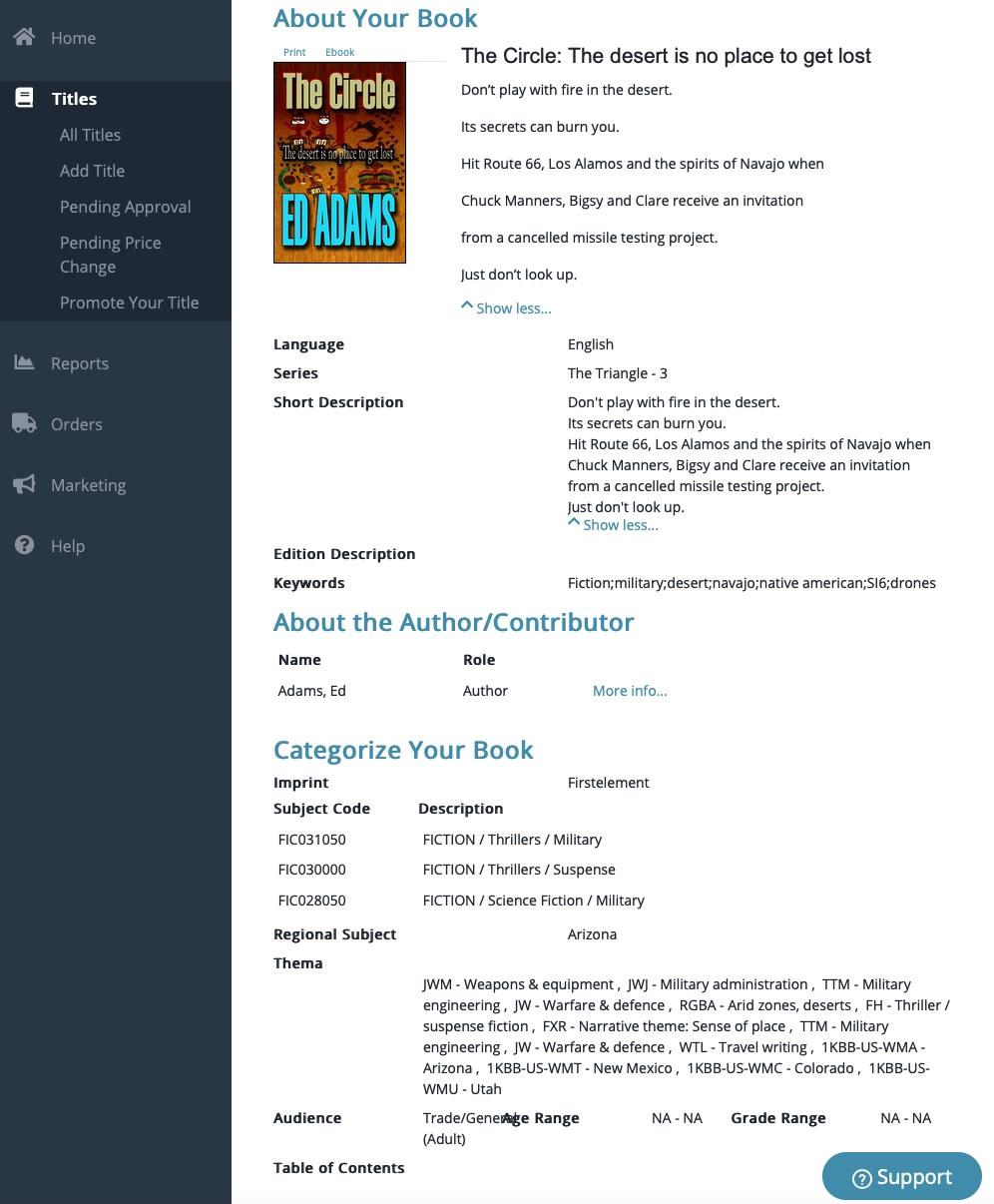
And I suppose the fun with this is currently about getting readers, so I'll be worrying soon about landing pages, mailchimp mailing lists and give-aways. But that can wait for another day
Tuesday, 18 February 2020
use of ERTMS signalling to improve headrooms on high density train lines
That's twice I've been in the pub recently and Brexit has popped up again. I thought it was all supposed to be done and dusted now that the new gangsters have taken back control.
A few land grabs of the House of Lords, the Judiciary, the Media and the Treasury and the Mekon will have safely installed a few of his loopy loops.
The thing is, he's starting to look worried now like it's all about to unspool.
The train thing is an interesting case in point. To HS2 or not to HS2? By the time it has been kicked into 2040, who cares? Even the Chinese can see a better opportunity to build something faster.
There's chitter-chatter about re-nationalisation now, but most of the franchise operators are already government-controlled. Just not UK-government. We've Germany running several lines, France running a few, Italy running some and even the Japanese, and the Dutch have some pieces of the pie.
Above is a list, although with the re-nationalisation of a couple of lines recently, it will soon be out of date.
That's like the rolling stock we have on one of our local lines. Designed in 1985, with literally spare bus parts and refurbished diesel engines (note the bus windows or the seats) the Pacers trundle around this neck of the woods steering clear of the speedier bullet nosed HSTs that link us to London.
I'm intrigued by signals too. London's Tube can run trains at 2-3 minute intervals by having plenty of signals and short blocks on their tracks. Why doesn't Railtrack do some of that too? Adding double the rolling stock running to a shorter service interval must be a quicker way to deliver the benefits of HS2 than the current ditch digging? Bring in some ERTMS signalling management with reduced headrooms, maybe. Or is the reticence because E stands for European?
Friday, 14 February 2020
Pulse - Ed Adams - Preorder now!
Thursday, 13 February 2020
dom ooda
I see, so the UK becomes a freeport hub. You plug money into one end and connect a fat cat to the other end and the hub converts the money into tax-free emoluments.
I can understand that we'd need a different kind of Exchequer to handle this. Dom probably has oodles of loops for it.
Maybe we could change a few laws (or lawyers, even?) and stand down some of the more difficult Cabinet members and media too? I hear Pelham make high-quality replacements.
Sunday, 9 February 2020
David Copperfield
Saturday we were in Notting Hill and decided to see the movie David Copperfield at the Everyman. It had a winning formula of star-studded cast and Armando Iannucci's writing and direction and it was, after all, a Charles Dickens novel set partly in London.
Somehow it didn't quite work for me; I could sense it was a joyous celebration of the roles, but it was all pitched somewhat frenetically. I know about editing the scene so you don't need to show the entries and exits, but this took it to another level maybe suited to click-generation viewing.
There were some good little character studies developed by the individual actors, but somehow it didn't gel into a story that one could feel empathy towards. It was just too jump-cut between rags/riches/rags/riches with everyone running around and flailing their arms, kites and donkeys about.
There's the status anxiety of Uriah Heep (Ben Wishaw), or the gadfly flittishness of Mr Dick (High Laurie channellling some of his left-behind comedic acting), Tilda Swinton as the indomitable Betsey Trotwood, Peter Capaldi as Mr Micawber waiting for something to turn up. The older David Copperfield was played by Dev Patel, and he smilingly kept the comedy pacing rolling along, even when doing the 'bang head on beam' gag several times in a row.
Iannucci gets under the skin of politics in some of his comedies (Thick of It and Death of Stalin), but this one, whilst dealing with the diversity of London in Victorian times, the rule of property landlords and sweatshop working conditions somehow didn't land the same kind of satirical punches that the other movies have managed.
I couldn't help noticing the extracted words from Dicken's pen during the film. It has made me want to read the book again.
Saturday, 8 February 2020
Cars at the V&A
Peeped into the Cars exhibition at the V&A. There were plenty of cars on display, but I wondered about the agenda. It did show oil depletion but didn't really show the progress on electric cars. I'd have liked to have seen a couple of examples, and maybe a cutaway example with the batteries section displayed.
Infinest Top Gear traditions, they had an E-Type jaguar on display. It looked suitably vintage until one noticed the cockpit which featured a flat panel display. Check it out in my picture below.
See, vintage steering wheel and then a computer console next door to it? But that seemed to be the token nod to electric cars, and perhaps also to British manufacturing. For small cars, there was the Messerschmidt bubble car and the Fiat 600. No Issigonis Mini on display. The show included mass production, featuring Ford and may be glossing over the Japanese. I was pleased to see The Fifth Element receiving recognition.
It was an interesting meander but I did wonder about Bosch the sponsor's curation criteria.
Friday, 7 February 2020
Madonna at The Palladium
Madonna at the Palladium was a show to remember. An intimate show, which demonstrated a transcendent magic from a performer who has re-inveted herself countless times. She chatted to the audience in a way that I doubt we'd see at a Stadium.
Fantastic evening, which we were asked not to describe too much, nor take pictures.
I was amused to hear hardened Londoners after the show, walking past the venue saying, "It must be a Madonna tribute act." No, we were on Madonna's Isla Bonita.
Monday, 3 February 2020
Saturday, 1 February 2020
Monday, 27 January 2020
Jojo Rabbit
I can tell it is the winter months because I've been to see around three movies recently. The latest was the satire JoJo Rabbit about a hitler youth's experience living in a village during the last days of World War II.
It is both comedic and shocking, with hardly any punches pulled as the story unfolds. The boy goes to youth camp to learn about guns and bombs and is seriously injured in a grenade incident. The scenes, cuts and dialogue are whip-smart and we later learn that his mother is hiding multiple secrets in their house.
Sometimes the scenes are predictable, but there's an edginess to much of the screenwriting that leaves one wondering who will get out alive.
The ideas of history and politics contained in “Jojo Rabbit” are terrifying. Absurd incompetents creating an enormous human tragedy.
It plays out here as dark humour, in a movie with a heart that leaves a lasting impression.
Sunday, 26 January 2020
Saturday, 18 January 2020
cover design
I listened to a short talk about book cover design a couple of days ago.
It went along the lines of "lead the reader into the book."
It implied that certain genres have certain motifs which repeatedly occur on the covers so that people know what they are buying into. Often the more successful ones will have a 'vanishing point' graphic on the cover with a silhouette of a person running towards it.
Above, I picked a few at random from a well-know bookseller, just to test the point.
Subliminally it is supposed to encourage a browsing person to dive into the book. I wonder if it is also to confuse the reader-to-be to select a book 'something along the lines of'?
I can remember the first cover for the Triangle, which went to a professional cover designer, and featured a single person moving towards the reader. It didn't get past the second edit, though, and we eventually settled on the orange cover, which could stand out well on (ahem) street banners and bus wraps.
Subscribe to:
Posts (Atom)